The ultimate reference guide to veganism taking shape in a coffee table book.

Design the world's first comprehensive guide to veganism from cover-to-cover, and a promotional website.

Moodboarding session with the client in Figma
In a kickoff meeting, we went over what the author's vision was and how he wanted the book to be percieved:
The layout had to make room for over 600 terms that each had different definition lenghts, pronounciations, and categories
To make navigation easier, we included Guide letters and term categories
To keep the dicitonary easy to read, while not wasting pages, we decided to include 2 terms per page.

Exploring concepts based on the directions set by the moodboarding session
Building on the moodboarding insights, I explored multiple concepts with varying: Typography styles, Word Structures, and Layout structures.
The first variations of the book cover
The winner concept from the first draft round was a layout where the most recogniseable words from the dictionary were arranged in the shape of a "V" (as in Vegan).
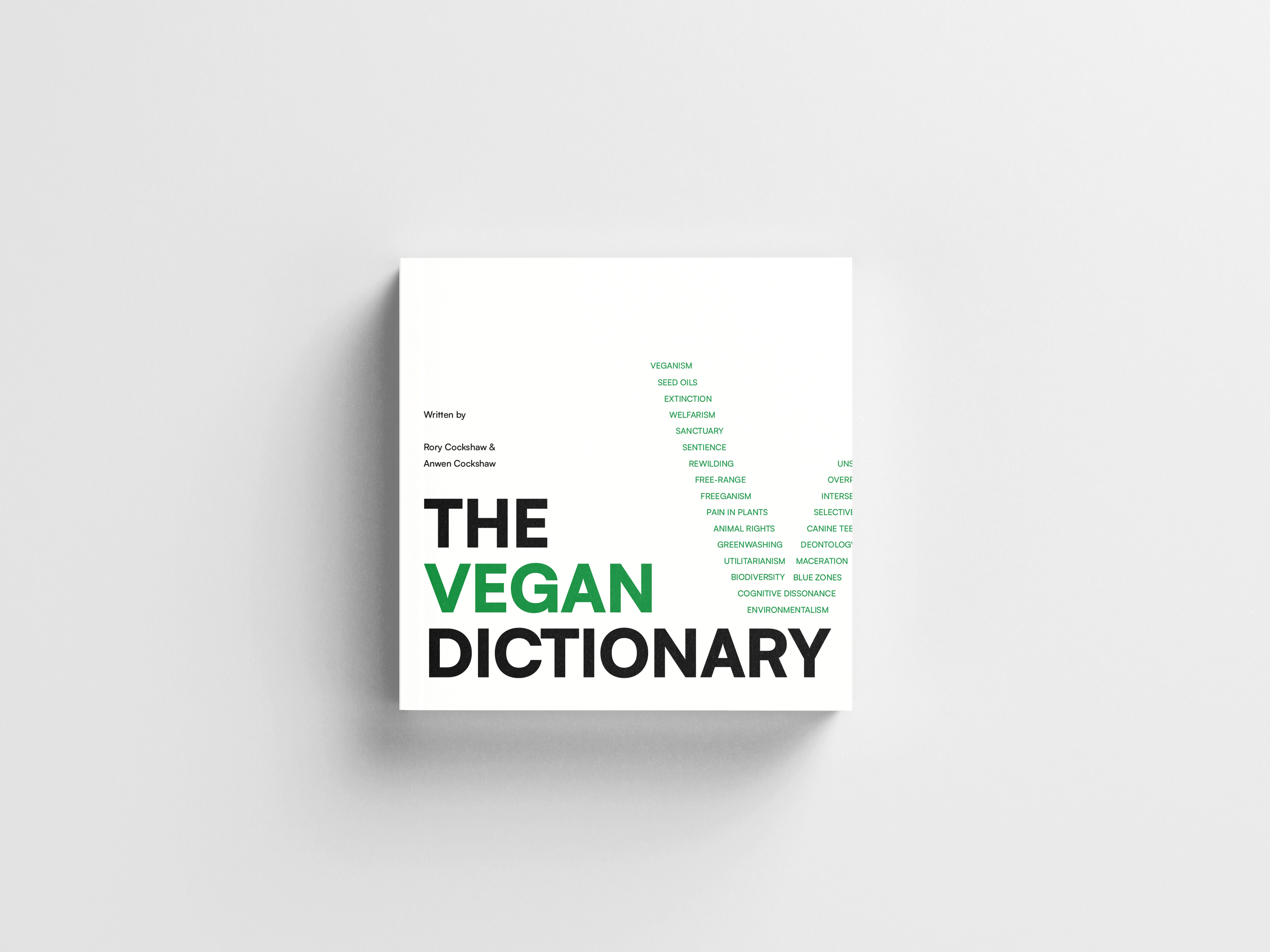
The final concept of the book cover

The final version of the book cover (with the back cover and the spine)
The layout had to make room for over 600 terms that each had different definition lengths, pronunciations, and categories.
To make navigation easier, we included Guide letters and term categories.
To keep the dicitonary easy to read, while not wasting pages, we decided to include 2 terms per page.
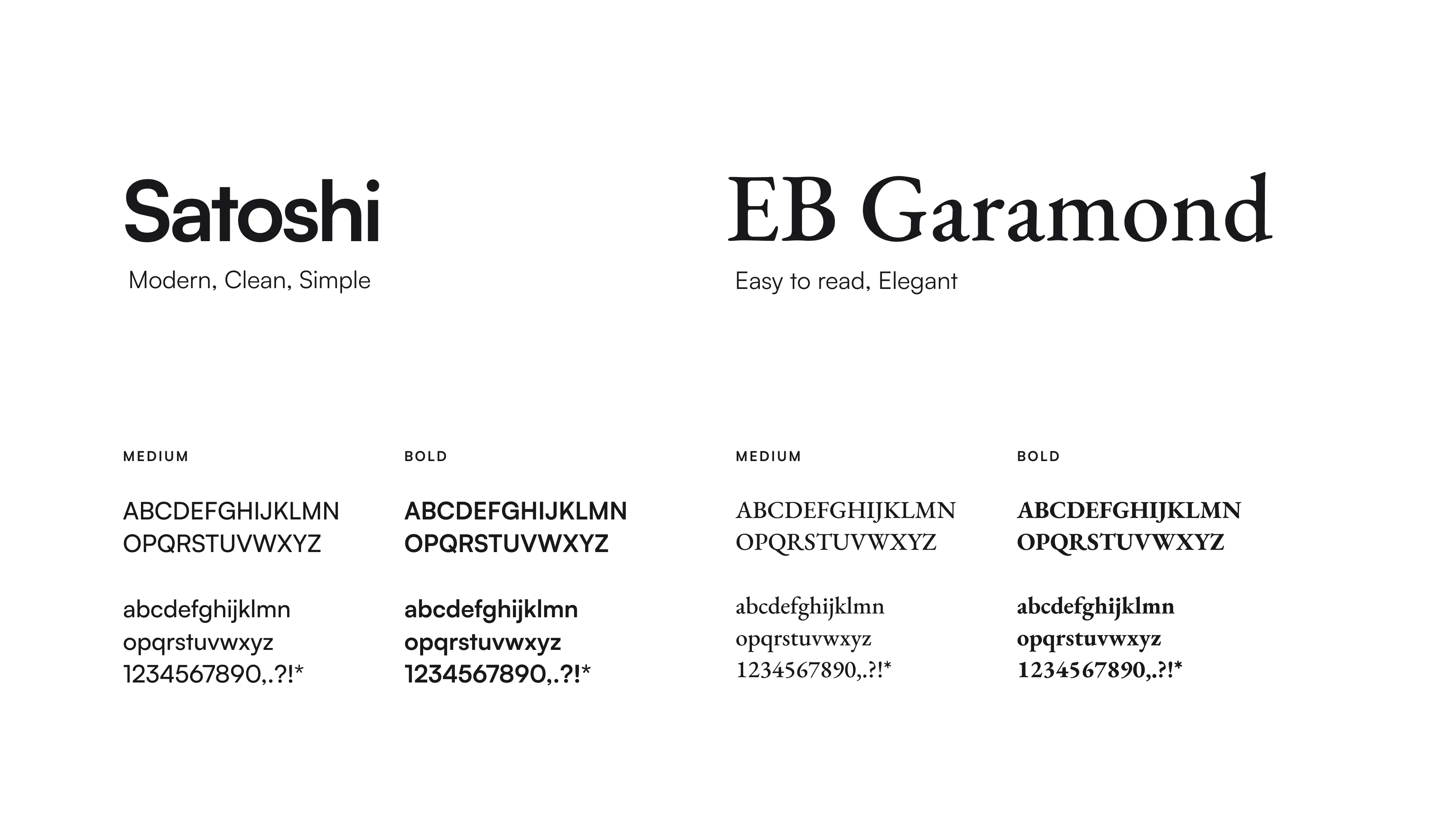
Typefaces used throughout the book
Since the entries varied in length, we chose left-aligned text for increased readability.
To make navigation easier and give a "dictionary feel" to the book – we decided to include a thumb index on the side of the pages that indicated which letter is present on each page, making navigation easier.
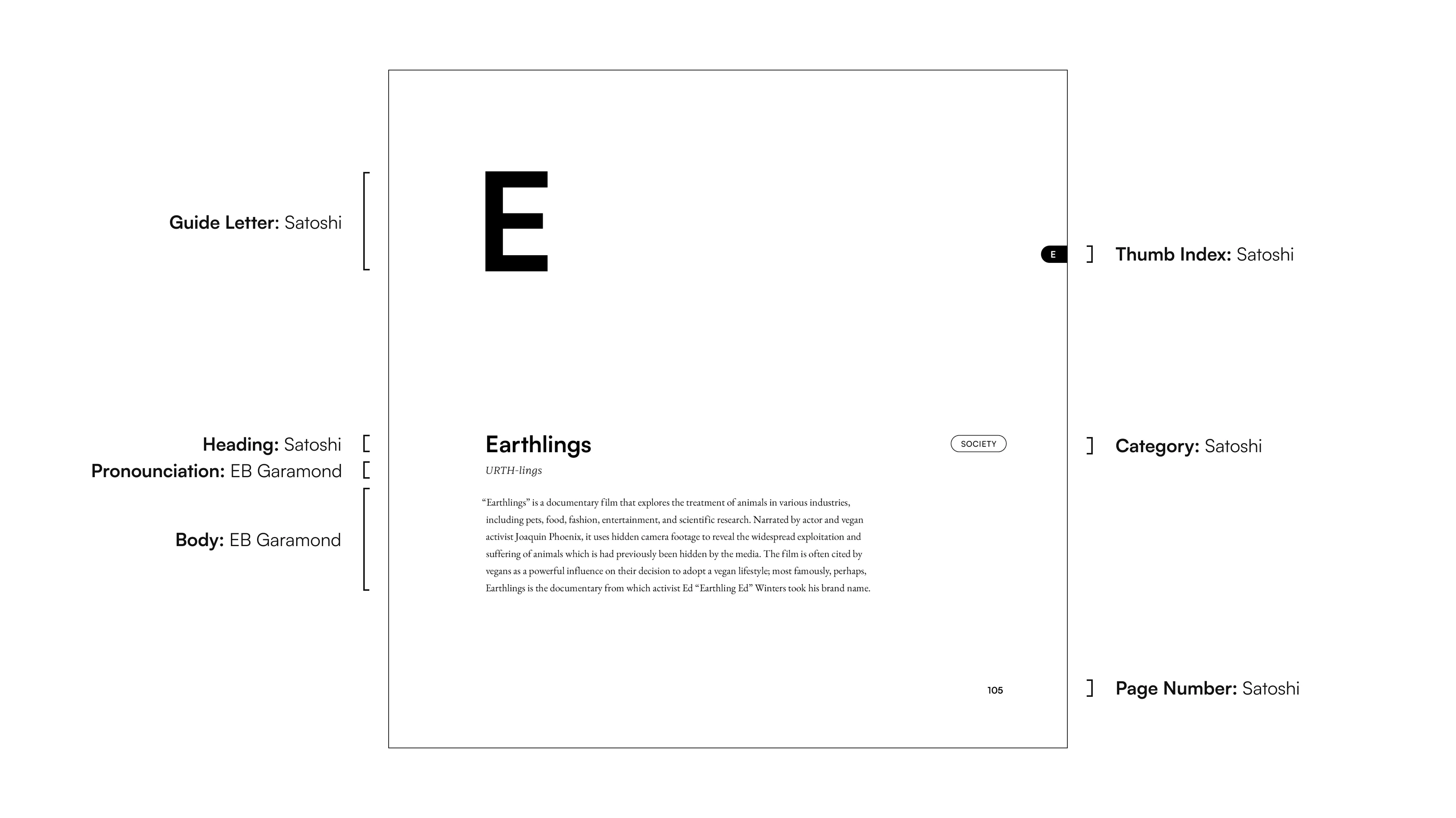
Page structure and typeface use

The final book interiour layout
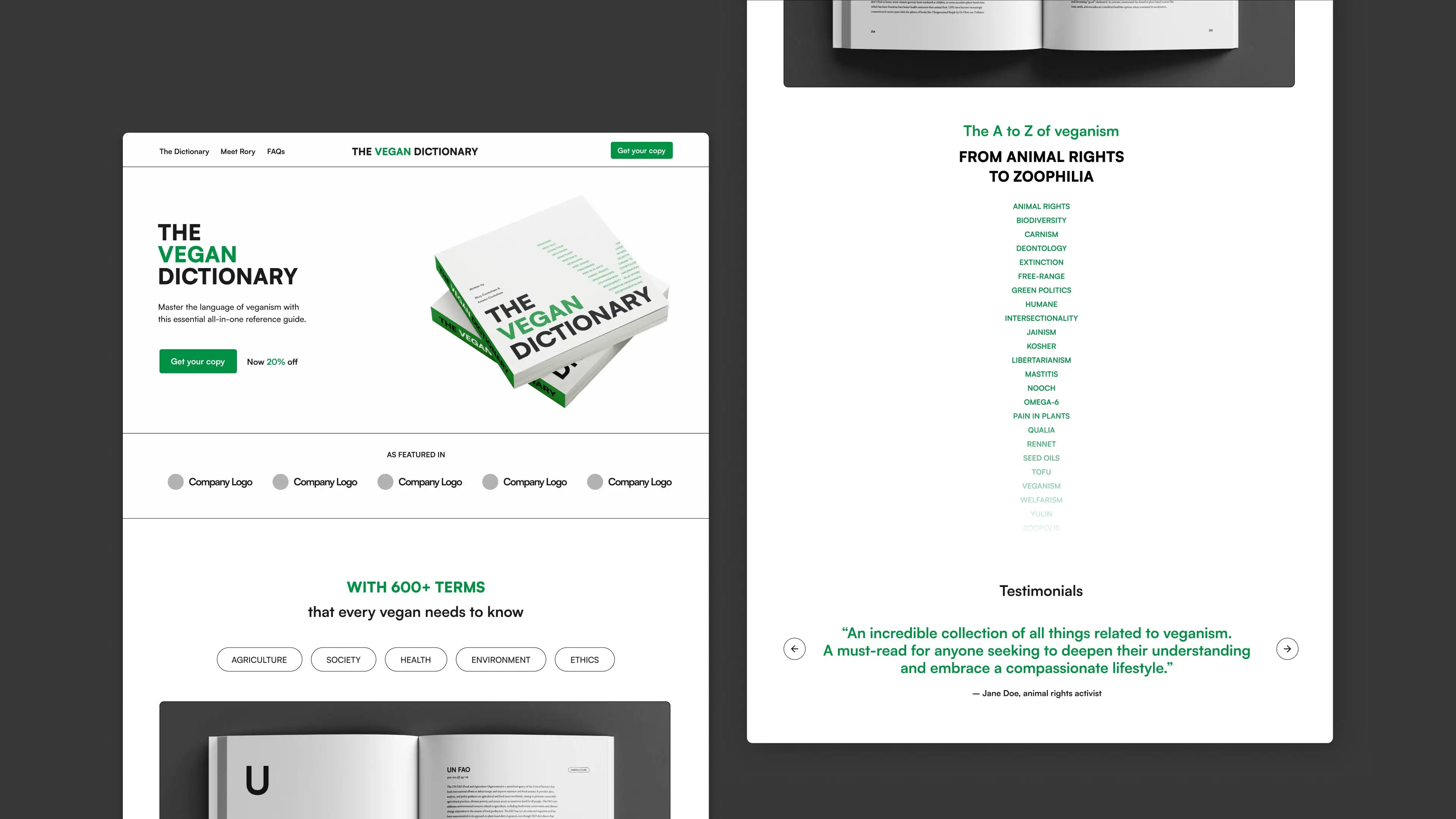
The one-page promotional website was built in Webflow.
Note: Changes to the website are managed by the client.
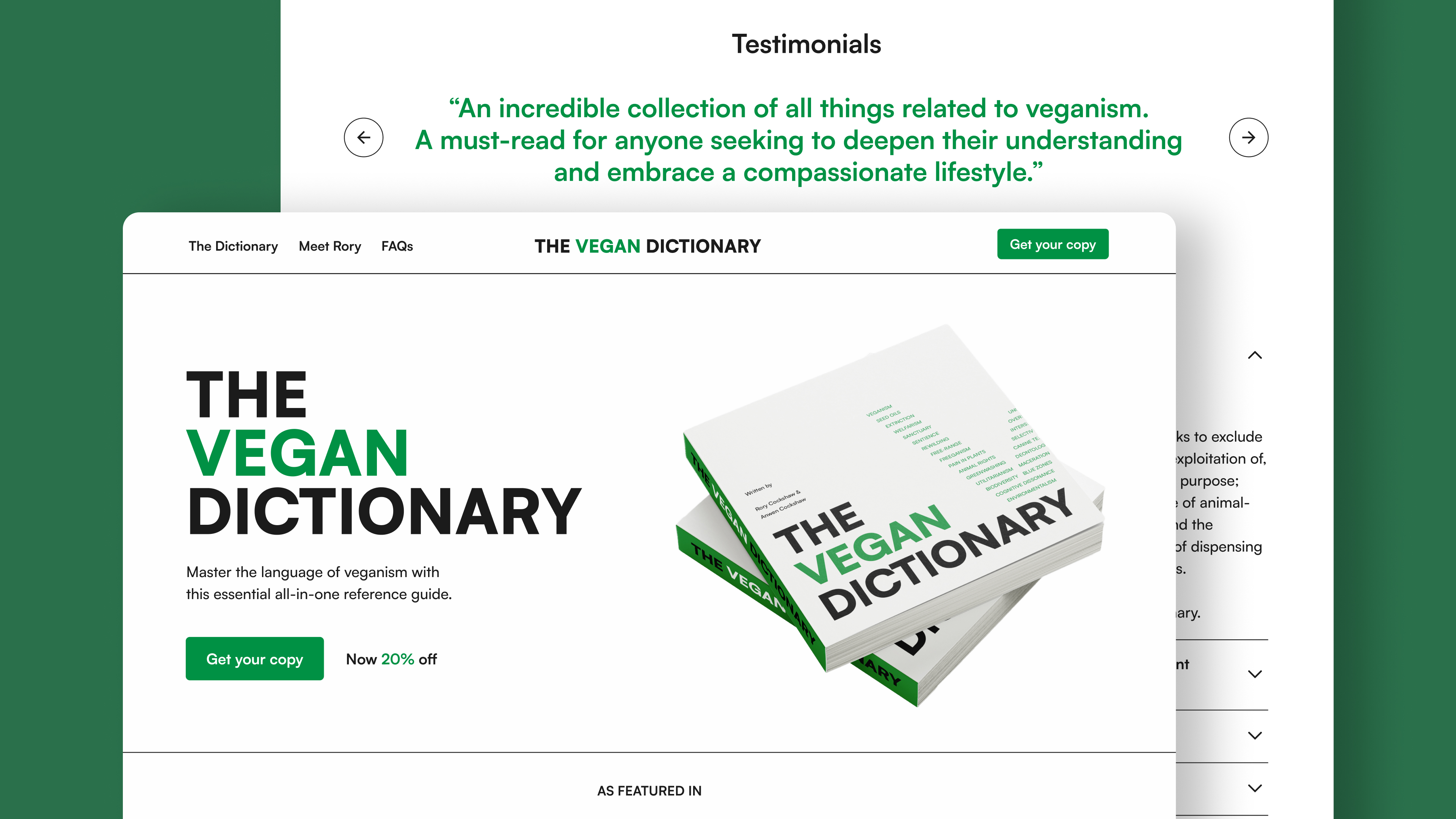
Website desktop version
By offering buying options
Highlight the book's features and benefits
Encourage visitors to sign up to the newsletter

Website mobile version
The clean, responsive, and user-friendly design was based off of the book’s aesthetic.
Clear calls-to-action (CTAs) are strategically placed throughout the page to guide visitors toward purchasing the book. Testimonials and user feedback are included to build trust.
website desktop version
"Ákos was hands-down the best design hire I could've made for my book. He worked quickly, made erudite suggestions, and is hugely conscientious."
– Rory Cockshaw, author of The Vegan Dictionary


